Powerful CTAs (Call-to-Actions) to Increase Engagement Fast

Your audience is ready to click but your CTAs might be silently pushing them away.
Every day, digital marketers, small business owners, and content creators pour time into websites, emails, and social posts… only to watch visitors leave without taking action. The missing piece? Powerful CTAs.
In this guide, you’ll learn:
- What CTAs are
- Why Call to Actions matter
- How to use CTAs to increase engagement fast
- What is the psychology behind high-converting call-to-action buttons
- Simple optimization tactics you can use today
After reading this article, you’ll know how to turn passive visitors into active leads and customers, without needing advanced technical skills.
Now, let’s get the basics out of the way.
What Are CTAs and Why Do They Matter?
CTAs (calls to action) are prompts that tell your audience what to do next. They guide users through your marketing funnel and move them toward a specific goal which can be:
- Signing up
- Downloading
- Buying
- Booking
A CTA can have different formats: it can be a button, a text link, a banner, or even a short sentence at the end of a blog post. Depending on what goal you have, your CTA format can differ.
What Powerful CTAs Do:
- Pursue users to the next logical step
- Raise click-through rate (CTR)
- Bring down decision friction
- Clarify the value of taking action
- Increase measurable engagement and conversions
For example:
- An ecommerce store might use: “Add to Cart”
- A SaaS company might use: “Start Your Free Trial”
- A blogger might use: “Download the Free Checklist”
Without a clear CTA, visitors are left guessing. And when people guess, they usually leave.
The Psychology Behind High-Converting CTAs
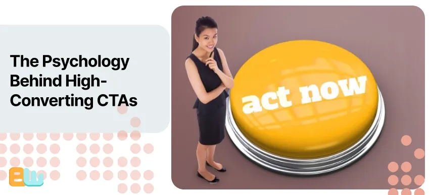
Powerful CTAs work because they tap into human psychology.
Action Words That Trigger Clicks
Strong verbs increase engagement because they create momentum. Words like:
- Get
- Start
- Discover
- Unlock
- Join
- Save
Compare “Submit” versus “Get My Free Guide.” One feels passive. The other promises value.
Small wording changes can dramatically increase conversion rates. Many conversion rate optimization (CRO) case studies show that benefit-focused CTAs outperform generic ones because they reduce uncertainty and highlight reward.
Emotional vs Logical CTAs
Emotional CTAs create desire. Logical CTAs justify action.
Emotional examples:
- “Unlock Exclusive Access”
- “Don’t Miss Out”
Logical examples:
- “Download the Free Report”
- “View Pricing Plans”
The most effective CTAs often combine both. For example:
“Start Saving Today” blends emotion (saving money) with logic (immediate action).
When writing CTAs, think about your audience’s motivation. Are they trying to solve a problem? Avoid a loss? Achieve a goal? Speak directly to that.
How Many Types of CTA Are There?
Not all CTAs are alike, there are actually many different types of CTAs and that’s what many beginners don’t know.
Most people expect CTAs to be simple buttons but there are actually different kinds of CTAs, each suited for different goals, platforms and stages on your marketing funnel. Choosing the right type depends on what you want your audience to do and where they are in their decision making journey.
1. Button CTAs (The Classic Conversion Driver)
Button CTAs are the most recognizable type. These are clickable buttons placed on landing pages, product pages, emails, and homepages.
Examples:
- “Start Your Free Trial”
- “Add to Cart”
- “Get Instant Access”
Best for:
- Purchases
- Sign-ups
- Booking calls
- Free trials
Why they work:
Buttons are visually prominent. When designed with strong contrast and clear wording, they immediately draw attention and make the next step obvious.
Pro Tip: Avoid generic text like “Submit.” Always clarify the benefit.
2. Text CTAs (The Subtle Persuader)
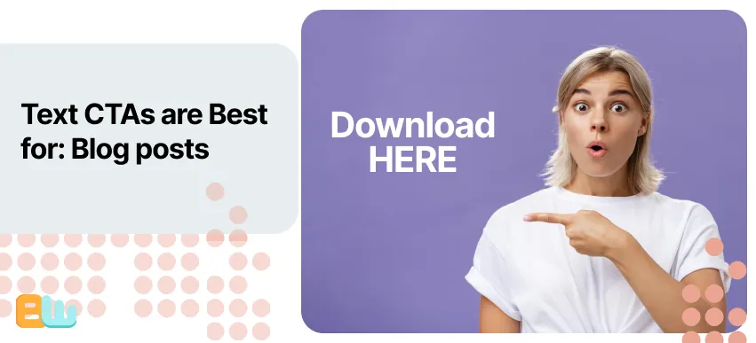
Text CTAs are hyperlinks embedded naturally inside content. They feel less “salesy” and more like helpful suggestions.
Example:
- “Download the free checklist here.”
- “Read the full case study.”
Best for:
- Blog posts
- Educational content
- Long-form guides
Why they work:
They naturally blend into the user’s reading experience and do not feel like an interruption, stopping your readers from becoming guarded against your CTA.
For better effectiveness content creators and bloggers usually use text CTAs mid-article because that’s when the reader is most engaged.
3. Email CTAs (Inbox Engagement Boosters)
Email CTAs are designed specifically for newsletters and campaigns. They often appear as buttons but can also be image-based or text links.
Examples:
- “Claim Your Discount”
- “Reserve Your Spot”
- “Watch the Webinar”
Best for:
- Promotions
- Event registrations
- Product launches
- Lead nurturing
Since email readers are already subscribed, your CTA should feel personal and relevant. Personalization by using the reader’s name or behavior data can help raise click-through rate significantly.
4. Pop-Up CTAs (Lead Generation Magnets)
Pop-up CTAs appear after a trigger, like scrolling 50% down a page or spending 30 seconds on a site.
Examples:
- “Get 10% Off Your First Order”
- “Download the Free Guide”
Best for:
- Growing email lists
- Offering discounts
- Promoting lead magnets
Why they work:
They interrupt attention but in a strategic way. When timed correctly, they capture visitors before they leave.
Warning: Overusing pop-ups can frustrate users. Timing and relevance are everything.
5. Sticky CTAs (Always Visible, Always Ready)
Sticky CTAs stay fixed on the screen as users scroll. They’re especially effective on mobile devices.
Examples:
- “Book Now”
- “Call Today”
- “Start Trial”
Best for:
- Local businesses
- Appointment-based services
- Mobile-heavy traffic
Because they’re always visible, they reduce friction. The user doesn’t have to scroll back up to take action.
6. Exit-Intent CTAs (Last-Chance Converters)
Exit-intent CTAs trigger when a user’s cursor moves toward closing the page (on desktop) or when certain behaviors suggest they’re about to leave.
Examples:
- “Wait! Get 15% Off Before You Go”
- “Download the Guide Before You Leave”
Best for:
- Recovering abandoning visitors
- Offering discounts
- Capturing emails
This type of CTA can really help improve your conversions since it targets the users who are showing signs of disinterest and are about to leave.
7. Social Media CTAs (Platform-Specific Prompts)

You will find these CTAs in captions, profile buttons, and ads on social media platforms like Instagram, LinkedIn, Facebook, and YouTube.
Examples:
- “Follow for More Tips”
- “Click the Link in Bio”
- “Swipe Up to Learn More”
Best for:
- Audience growth
- Traffic generation
- Brand awareness
Social media CTAs need to be short, clear, and action-oriented since attention spans are shorter.
8. Micro CTAs (Low-Commitment Actions)
Micro CTAs are small steps that move users closer to a bigger action.
Examples:
- “Learn More”
- “See How It Works”
- “View Demo”
Best for:
- Top-of-funnel visitors
- New audiences
- Complex products
Micro CTAs reduce pressure. Instead of asking for a purchase immediately, they build momentum.
Which Type of CTA Should You Use?
Here’s a simple breakdown:
- Use button CTAs for primary conversions.
- Use text CTAs within blog content.
- Use pop-ups for list building.
- Use sticky CTAs for mobile users.
- Use exit-intent CTAs to recover lost traffic.
- Use micro CTAs to warm up new visitors.
- Use email CTAs for nurturing subscribers.
- Use social CTAs for audience growth.
The real power comes from combining them strategically across your funnel.
For example:
- A blog post may include text CTAs mid-content.
- A sticky mobile CTA at the bottom.
- An exit-intent pop-up offering a free resource.
Different types of CTAs serve different purposes and when aligned with user intent, they dramatically increase engagement.
CTA Placement Strategies That Increase Engagement
Even a great CTA will fail if it’s placed poorly.
Here’s how placement impacts performance:
| CTA Placement Location | Best For | Pros | Cons | Example Use Case |
| Above the Fold | Immediate sign-ups | High visibility | Can feel pushy | Free trial offer |
| Mid-Content | Engaged readers | Contextual relevance | May be overlooked | Lead magnet in blog |
| End of Page | Committed users | Natural next step | Lower visibility | Product purchase |
| Sidebar | Ongoing promotion | Constant presence | Banner blindness | Newsletter signup |
| Sticky Footer (Mobile) | Mobile traffic | Always visible | Can clutter screen | Book appointment |
Above-the-fold CTAs work → when visitors already know what they want.
Mid-content CTAs work → when it’s tied directly to the topic being discussed.
End of page CTAs work → when you’ve already delivered value in your blog post.
The best approach? Test multiple placements and measure results.
How to Write Powerful CTAs That Convert (Step-by-Step)

Writing powerful CTAs doesn’t have to be complicated. Follow this simple formula.
5-Step Formula for Writing Powerful CTAs:
- Start with a strong verb
- Focus on the benefit, not just the action
- Remove friction words
- Add urgency when appropriate
- Test variations
Let’s look at examples.
Before: “Submit”
After: “Get My Free Template”
Before: “Sign Up”
After: “Start Growing Your Email List Today”
For small businesses:
- “Book a Consultation” becomes “Book Your Free 15-Minute Strategy Call”
For ecommerce:
- “Buy Now” becomes “Grab Yours Before It’s Gone”
For content creators:
- “Subscribe” becomes “Join 10,000+ Weekly Readers”
Notice how each improved CTA highlights value and reduces hesitation.
How to Optimize and Test Your CTAs
If you’re not testing your CTAs, you’re guessing.
A/B testing (also called split testing) allows you to compare two versions of a CTA to see which performs better. Even small changes can impact results.
What to Test in Your CTAs:
- Button color
- Copy wording
- Placement
- Button size
- Mobile responsiveness
Many beginners assume color alone drives performance. In reality, contrast matters more than specific colors. A CTA should stand out clearly from the background.
Start simple:
- Test one variable at a time.
- Run tests long enough to gather meaningful data.
- Measure click-through rate and conversion rate.
Optimization is ongoing. What works today may not work six months from now.
Common CTA Mistakes That Kill Engagement
Even experienced marketers make these mistakes.
Avoid These CTA Errors:
- Using vague language like “Click Here”
- Overloading a page with too many CTAs
- Failing to highlight the benefit
- Ignoring mobile users
- Using low-contrast button colors
Too many CTAs create confusion. Instead, use one primary CTA and, if needed, one secondary CTA.
Clarity converts. Confusion kills engagement.
Conclusion
Powerful CTAs are not just buttons, they are strategic tools that guide your audience toward action. When written clearly, placed intentionally, and tested consistently, CTAs can dramatically increase engagement and conversions.
Remember:
- Use strong verbs.
- Focus on benefits.
- Match CTA type to your goal.
- Test and optimize regularly.
Now it’s your turn. Review your website, emails, or landing pages today and ask yourself: Are my CTAs guiding users or leaving them guessing?
Start small. Test one improvement. Watch what happens.
Frequently Asked Questions
What makes a CTA effective?
A good CTA tells users exactly what they will gain by clicking, so it has to be:
- Clear
- Benefit-driven
- Action-oriented
- Easy to see
How many CTAs should a page have?
Most pages usually have one primary CTA and maybe one secondary CTA. Remember that too many options will confuse your potential clients.
What color should CTA buttons be?
There’s really no universal best color. The best practice is to use contrast to get your CTA to stand out visually.