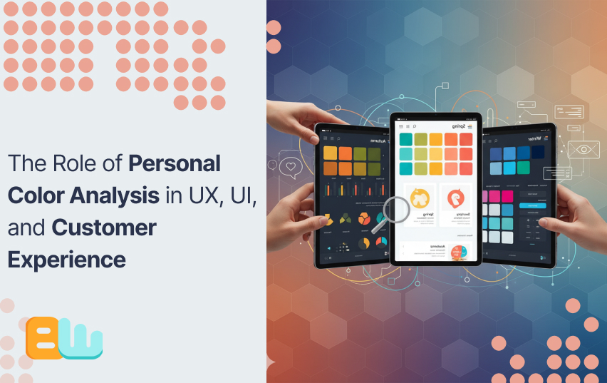
The Role of Personal Color Analysis in UX, UI, and Customer Experience
Introduction: Understanding Personal Color Analysis in Design
Do you know why some apps feel more inviting than others? Why is FaceBook famous for its blue logo or why Coca Cola never changes the black and red theme of their label?
The answer lies in the psychology of colors they use. Personal color analysis is a method that identifies which colors harmonize with an individual’s natural features, like skin tone, hair, and eye color. This technique which is rooted in fashion and beauty, is now making waves in UX and UI design.
Colors do more than beautify, they shape how users feel and act. Each color has a specific emotion assigned to it in color theory. By applying personal color analysis, designers can create interfaces that resonate emotionally with users, they can even offer personalization options to make their app or website feel like home to the users.
Down below, we will talk about how personal color analysis influences UX, UI, and overall customer experience. We will observe its psychological effects, practical applications, and how it can boost user engagement and satisfaction. If you are a designer, a marketer, or simply interested in the concept, this guide will provide useful information about the influence of color in design.
The Psychology of Color in User Experience
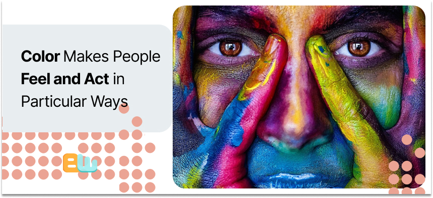
Color isn’t just decoration, it’s a powerful driver that makes people feel and act in particular ways. Colors used in UX and UI design trigger emotions, guide choices, and even create trust.
Emotional Impact
Colors evoke specific feelings. Blue, for example, is often used to convey trust and calmness, so it is typically taken for financial apps. Red is employed to inspire urgency or excitement, thus it is used on sales buttons. Such emotional cues help users to engage and use digital products more effectively.
Cultural Significance
Color symbolism is different in every culture; for example white is a purity indicator in western cultures while some Asian cultures wear it as a sign of mourning. Designers must consider these differences to ensure their designs will be well received by different audiences.
Case Studies
- Spotify: Uses green symbolizing growth and creativity which is in line with its brand identity.
- HubSpot: Realized that red worked better than green in call-to-action buttons, probably because of its attention-grabbing nature.
Designers can create a more effective user experience by understanding and applying color psychology.
Integrating Personal Color Analysis into UI Design
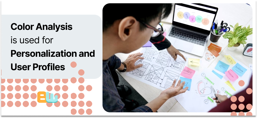
Now you may wonder how a UI designer can benefit from knowing their users’ personal color analysis? The answer is simple: Personalization and User Profiles
Personalization
Personal color analysis can help tailor UI elements to each individual’s preference. For instance, platforms like Colorwise.me allow users to discover their ideal color palettes, which can then inform design choices . This personalization can lead to a more comfortable and engaging user experience.
A user might find the color red triggering, they can have the option to completely remove the color from their experience, another user might suffer from color blindness or partial blindness and find some colors easier to find than others, they can apply their preferred colors to their preferred actions.
User Profiles
Incorporating color preferences into user profiles enhances UI design. By understanding a user’s favored colors, designers can adjust interfaces to align with these preferences, creating a more intuitive and satisfying experience .
You can automatically design their feed, their DMs, their playlists or their headers with their favourite color. This will make them spend more time on your platform unconsciously.
Tools and Techniques
Several tools assist in integrating personal color analysis into UI design:
- Colorwise.me: Offers AI-driven color analysis to determine users’ best colors.
- Paletton: A color scheme designer that helps create harmonious color combinations
Traditional UI Design vs. UI Design with Personal Color Analysis
| Aspect | Traditional UI Design | UI Design with Personal Color Analysis |
| Color Selection | Fixed palettes | User-preferred palettes |
| User Engagement | Standard experience | Tailored experience |
| Personalization Level | Low | High |
| Tools Used | Basic color tools | AI-driven color analysis tools |
Incorporating personal color analysis into UI design not only enhances personalization but also improves user engagement and satisfaction.
Enhancing Customer Experience Through Color
Colors determine how individuals perceive a brand. A single, uniform color palette produces recognition and trust. As individuals see the same colors on websites, apps, and adverts, they get familiar. This consistency produces brand identity and keeps users engaged.
Besides identification, color influences satisfaction. Users prefer more fluid experiences when visual elements are thought to be balanced and meaningful. Good contrast improves readability, and complementary color schemes push attention naturally. Navigation becomes easier, and frustration is reduced.
As stated above color also supports accessibility. Accessible designs improve overall user experience and prevent drop-offs. It can even get you promotions in niche sections.
Psychological alignment matters too. Choosing colors that match a brand’s personality strengthens emotional connection. Users are more likely to interact, explore, and return.
Finally, testing and repetition are key. Find out which palettes satisfy the users best by gathering user feedback on color preferences or using A/B testing. This data collection will help you make better choices to optimize your user journey.
| Color | Emotional Effect | UX Application | Conversion Impact | Example Use |
| Red | Excitement, urgency | Call-to-action buttons, sales | ↑ Click-through by 21% (Invesp) | “Buy Now” buttons |
| Blue | Trust, calm | Backgrounds, headers, forms | ↑ Form completions | Banking apps, SaaS platforms |
| Green | Relaxation, growth | Success messages, eco-friendly themes | ↑ Retention | Health & wellness apps |
| Orange | Enthusiasm, energy | Promotions, highlights | ↑ Engagement | Limited-time offers |
| Purple | Creativity, luxury | Product highlights, branding | ↑ Premium perception | Subscription boxes, fashion sites |
| Yellow | Optimism, attention | Alerts, attention cues | ↑ Focus on key info | Notification banners |
Practical Applications and Tools
AI tools make personal color analysis easier for designers. You can save time by using the tools to analyze user preferences, suggest palettes, and predict emotional responses to create interfaces that feel personal.
They have already been effectively applied by some brands. Online stores, for example,adjust product displays based on user color preferences. Spotify and Pinterest also apply customized color schemes to encourage interaction. These examples are evidence that color analysis increases satisfaction and has users returning for more.
Inserting color analysis into your workflow does not have to be daunting. Start by selecting one AI tool and test on a minuscule area of your design. Collect feedback and track engagement metrics. Over time, refine your approach and expand to larger projects.
Here are some more AI-powered tools for personal color analysis in design:
- Colormind: Generates palettes based on AI analysis.
- Adobe Color: Suggests harmonious colors for user interfaces.
- Coolors: Helps explore and save personalized palettes.
- Khroma: Uses AI to learn your favorite colors and create suggestions.
- Color AI: Predicts user responses to color choices.
Using these tools, designers can make informed choices and create experiences that feel personalized, consistent, and engaging.
Challenges and Considerations
Color perception is not an objective experience. Two users may experience the same color differently which will affect their response to a design. Designers have to remember that what is right for one may not be appealing to another.
Cultural variations also matter. Colors convey different meanings in different regions. Red, for instance, is used to symbolize passion and love in the west but happiness and fortune in some Asian cultures. Overlooking such differences can confuse users or decline usage.
Accessibility is also something to be considered. The majority of users have color vision deficits, which make it hard for some palettes to be readable or comprehensible. Contrast checkers and accessibility simulators are utilized to ensure designs will remain accessible to all users.
Individual color analysis must be weighed against these problems. With testing against diverse audiences and accessibility consideration, designers can create experiences that look good and invite everyone in.
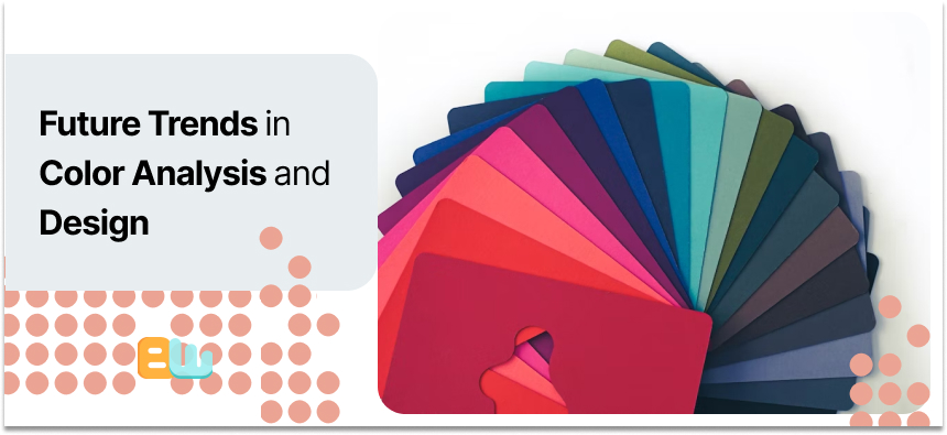
Future Trends in Color Analysis and Design
Like everything else, technology has also changed how we interact with colors. AI can now analyze user behavior and alter interfaces in real time. This allows for a more personalized style in design, making it easier to develop welcoming designs.
Personalization is becoming a significant trend. Brands are utilizing data to personalize colors for specific consumers, driving engagement and satisfaction. Tailored color palettes can make emails, apps, and websites more relevant.
The future of color analysis in UX and UI looks promising. Even more tools will combine behavior data with visual affinity to enhance user experiences, say experts. We may even get to see interfaces that dynamically change color based on user mood, place, or time of day.
Designers who embrace these trends can create better experiences. By experimenting with new tools, you can keep your designs up-to-date and usable.
Conclusion: The Significance of Personal Color Analysis in Design
Designers can create more engaging and inclusive interfaces by integrating personal color analysis in their workflow. We now know how color affects emotions, perception and actions. Designers can subtly nudge users to do their desired action by using colors strategically.
We also covered tools, practical applications, and challenges like cultural differences and accessibility.
As design becomes more personalized, understanding color’s role is essential. By applying these insights thoughtfully, you can create experiences that feel intuitive, accessible, and visually appealing. Personal color analysis is not just aesthetics, it’s the way to a smart design.
Frequently Asked Questions
What is the five color rule?
It suggests using five main colors in design to create balance and consistency.
How do I find my flattering color?
Personal color analysis tools or a color expert can help you.
What is the 60-30-10 rule for color palettes?
It means you should distribute colors as 60% dominant, 30% secondary, and 10% accent for visual harmony.
What are the 4 types of color analysis?
Winter, Spring, Summer, and Autumn. These help determine flattering tones.
Can ChatGPT do my color analysis?
It can guide you but cannot replace professional visual assessment.